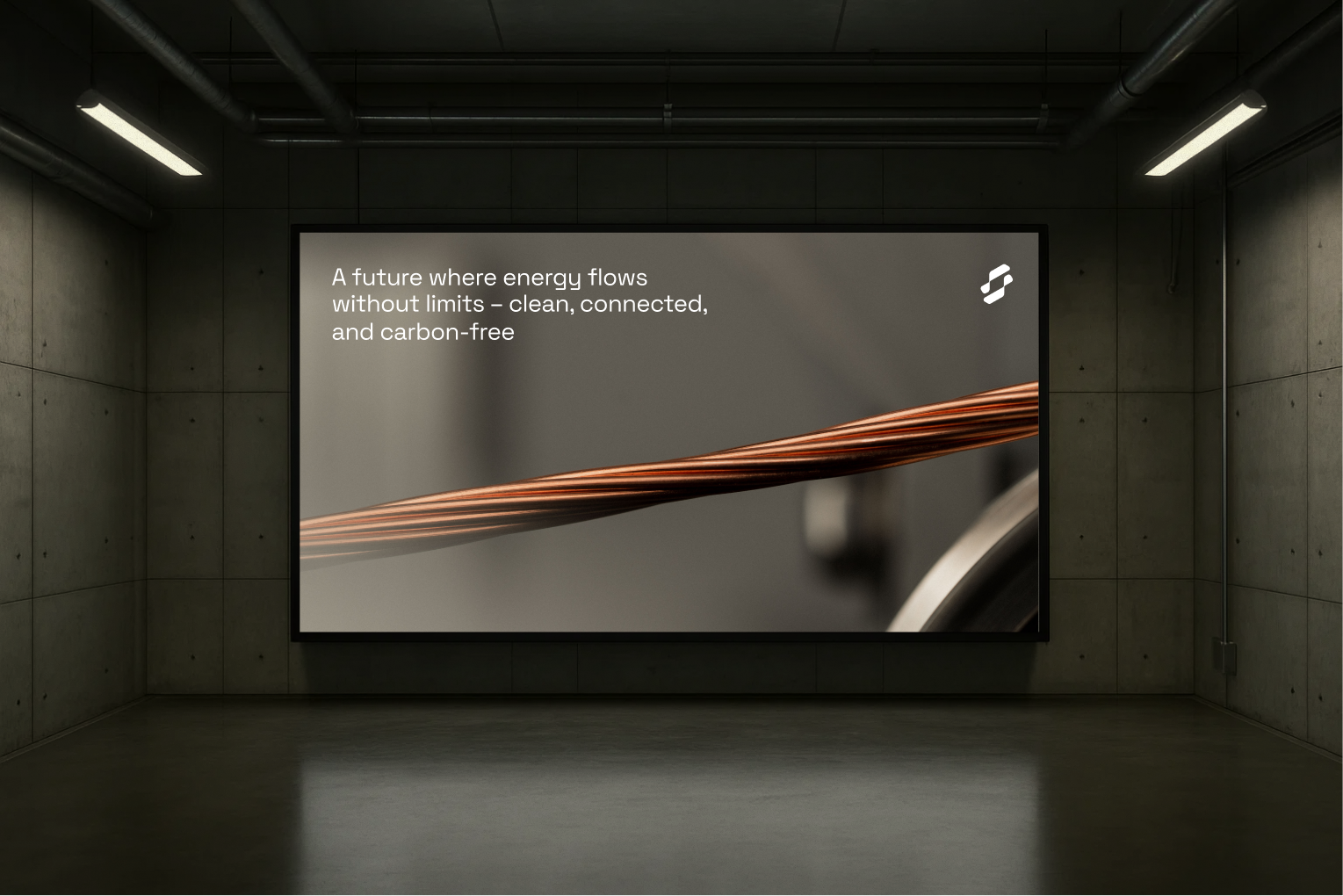
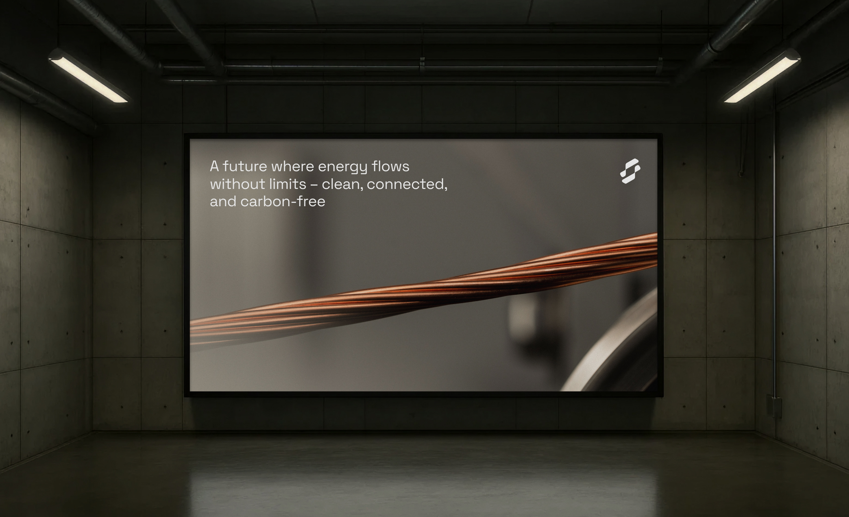
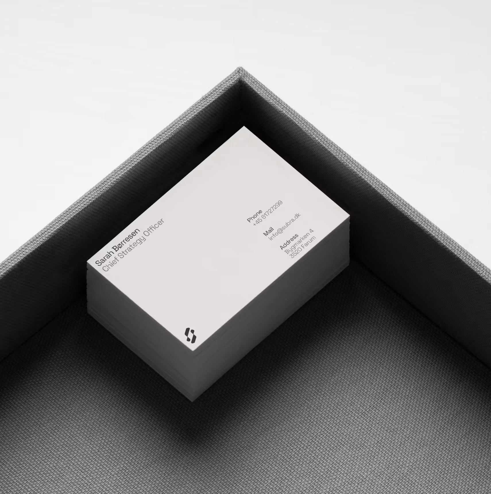
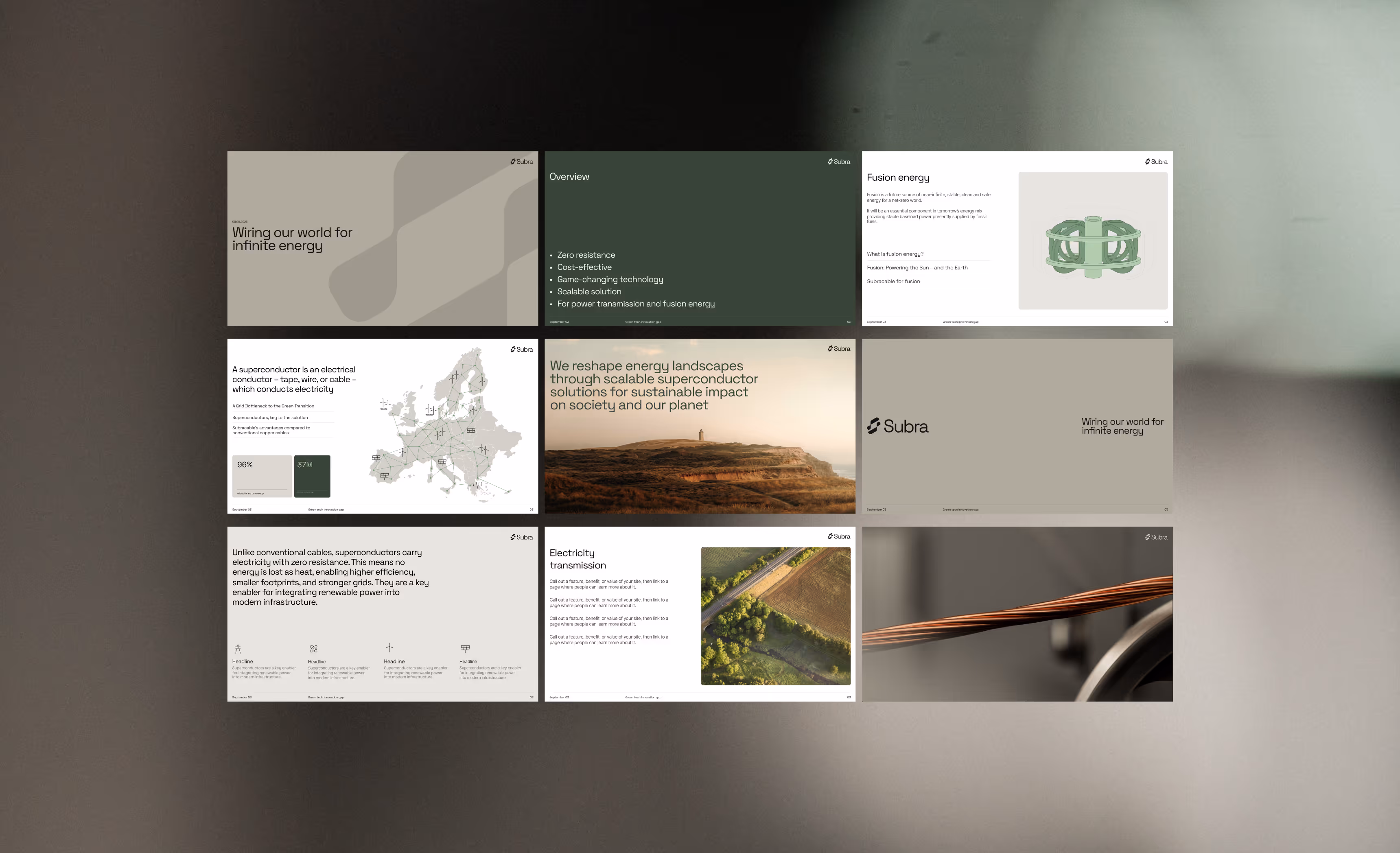
We partnered with the deeptech company Subra to redefine and strengthen their brand. The new identity balances precision and humanity with a clear forward-looking perspective. A clean, contemporary visual language supports clarity, ambition, and scalability, creating a strong and future-proof foundation.
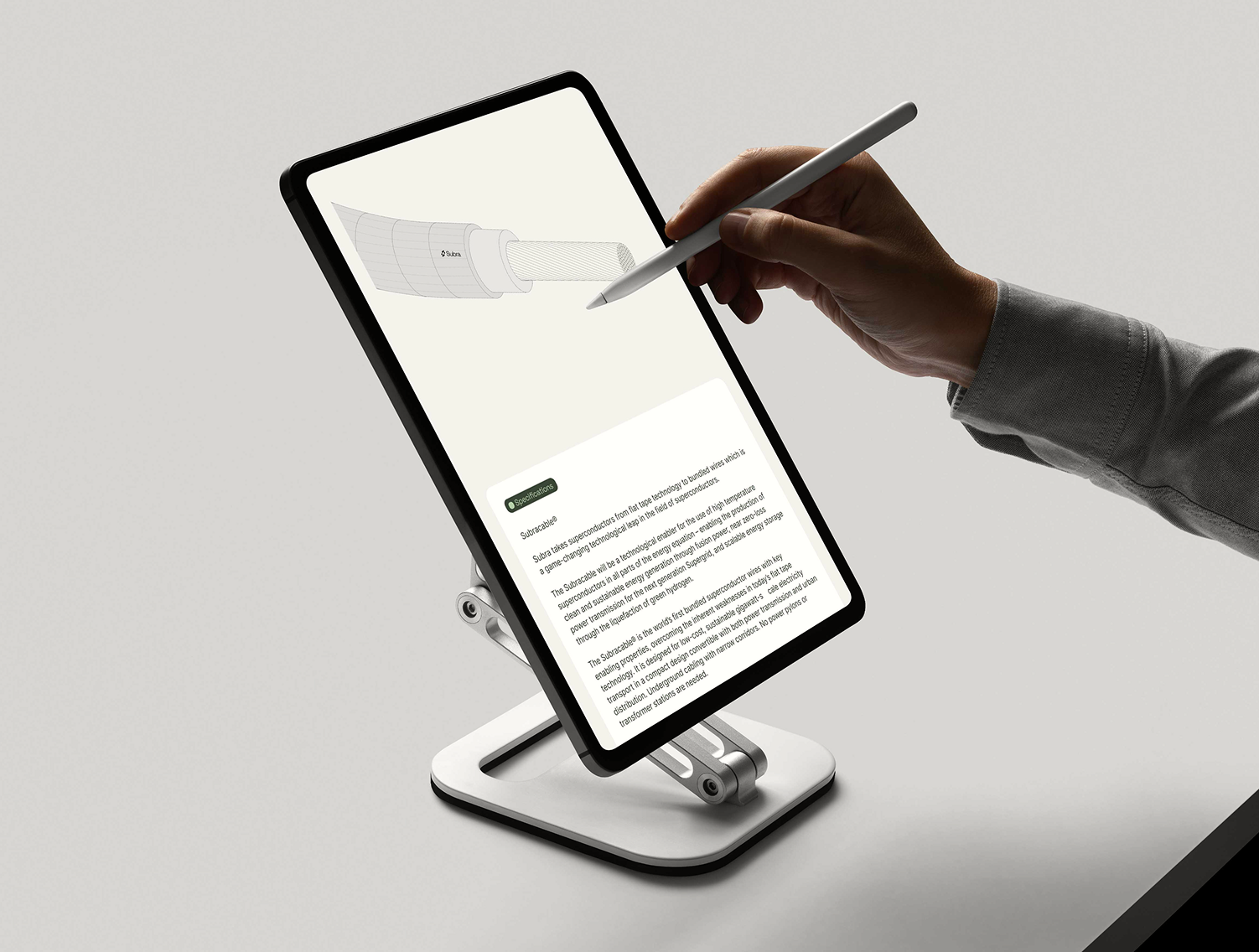
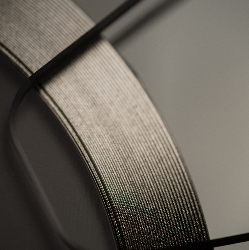
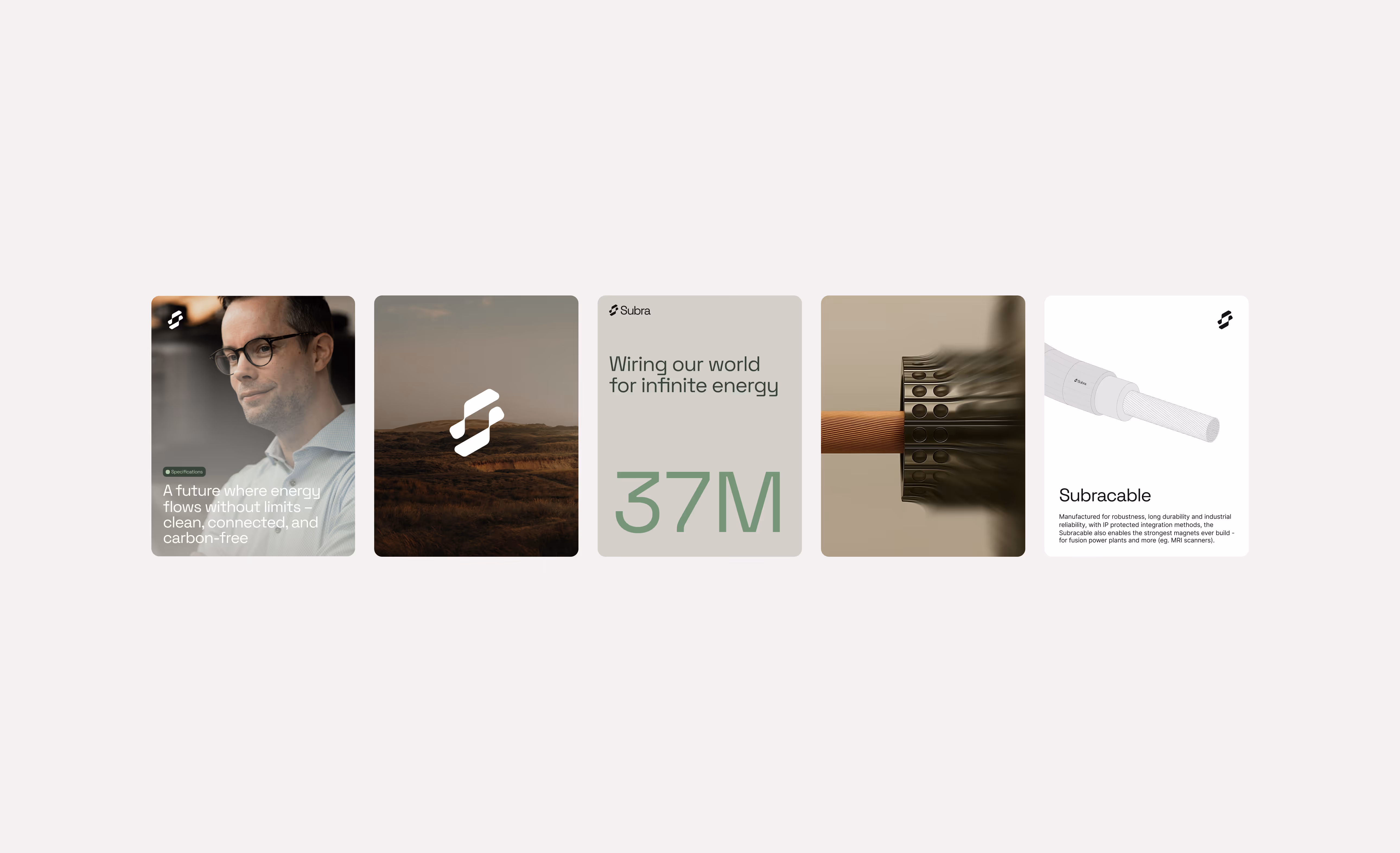
The logo draws inspiration from the Subracable, visualising the transformation from flat tape technology into bundled wires. This evolution symbolises flexibility, connectivity, and growth. The form subtly references the letter “S” for Subra, while also alluding to superconductivity, anchoring the identity in the company’s technological core.
Copyright: © Subra. All rights reserved. All content is the property of Subra and may not be copied, reproduced, distributed, or used without prior written permission.
Disclaimer: Certain visual elements are presented at concept level and may not yet be fully realised.